Google Chrome changing logo for the first time in eight years; Know details
A designer for Google Chrome, Elvin Hu has uploaded the new Google Chrome logo on Twitter, highlighting the subtle changes made to the web browser's logo.
- Tech News
- 2 min read

One of the most popular web browsers for mobile and desktop devices, Google Chrome was launched in 2008. Back then, the company had a three-dimensional logo with iconic colours - red, yellow and green. Over the years, it has carried forward the same logo with minor changes. After the last change that was made in 2014, Google Chrome's logo is getting a makeover again. Keep reading to know more about the changes that are being made in Google Chrome's logo.
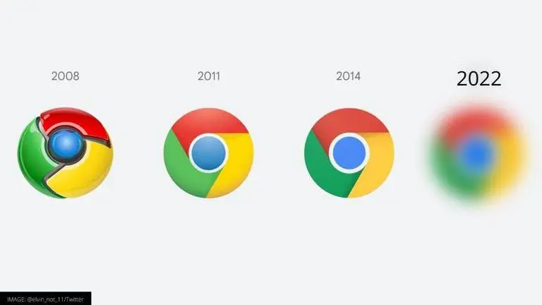
A designer for Google Chrome, Elvin Hu has uploaded the new Google Chrome logo on Twitter. In his post, the designer has placed all the previous Google Chrome logo's along with the new one, to make it easier for the viewers to see the differences. The Google Chrome new logo is slightly different from the current one, but some people might not be able to spot the changes as the changes are very subtle. This is the first time in eight years that Google Chrome is changing its logo, the designer informed in a Twitter post.
Fun fact: we also found that placing certain shades of green and red next to each other created an unpleasant color vibration, so we introduced a very subtle gradient to the main icon to mitigate that, making the icon more accessible. pic.twitter.com/H26wQKRhp9
— Elvin 🌈 (@elvin_not_11) February 4, 2022
What are the changes in Google Chrome's new logo?
- As highlighted by Elvin Hu, one of the designers at Google Chrome, the new brand logo does not have shadows
- The four colours used in the logo - red, green, yellow and blue are brighter than before
- The new logo contains a gradient in the red colour to eliminate an unpleasant colour vibration
- The logo has been customised for different operating systems, including Windows and macOS
The designer also mentions that these new logos will start appearing on all devices, including desktops, the mobile versions on both Android and iOS in the coming few months. Interestingly, Google was also considering trying out a new logo with a golden and blue colour scheme, and with exaggerated separation between elements in the current logo, but those designs did not work out for the company. The designer explained that making big changes in the logo makes it difficult to recognise alongside Google's other applications as they also follow a similar colour scheme.
You might also wonder, "did you consider sth. more different?" We did! E.g., we explored introducing more negative space. However, in context, the white required a stroke that shrunk the icon overall, and made it more difficult to recognize, especially next to other Google apps. pic.twitter.com/9BYZVbAlbf
— Elvin 🌈 (@elvin_not_11) February 4, 2022
Stay tuned for more updates on Google and other technology news.
