Published 12:41 IST, March 6th 2024
Of these factors, font selection emerges as a critical aspect with the potential to influence your real estate postcards' efficacy greatly.
Advertisement
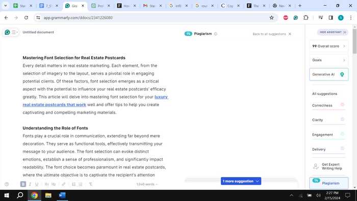
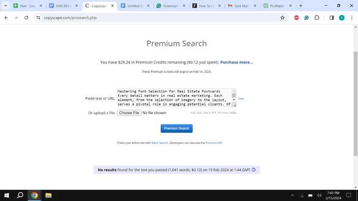
Every detail matters in real estate marketing. Each element, from the selection of imagery to the layout, serves a pivotal role in engaging potential clients. Of these factors, font selection emerges as a critical aspect with the potential to influence your real estate postcards' efficacy greatly. This article will delve into mastering font selection for your luxury real estate postcards that work well and offer tips to help you create captivating and compelling marketing materials.
Understanding the Role of Fonts
Fonts play a crucial role in communication, extending far beyond mere decoration. They serve as functional tools, effectively transmitting your message to your audience. The font selection can evoke distinct emotions, establish a sense of professionalism, and significantly impact readability. The font choice becomes paramount in real estate postcards, where the ultimate objective is to captivate the recipient's attention swiftly and convey vital information succinctly. It is not merely about aesthetic appeal but about strategically utilizing typography to enhance the effectiveness of your communication. Each font carries its personality and tone, influencing how the viewer perceives and receives your message. Therefore, font selection must be carefully considered to ensure alignment with the intended message and the target audience's preferences. Ultimately, the font chosen can make a profound difference in the success of your real estate postcard campaign, serving as a powerful tool for capturing attention and driving engagement.
Advertisement
Choosing the Right Typeface
Selecting the appropriate typeface is paramount when it comes to font selection. It sets the tone for your real estate business and reflects its branding; for luxury real estate postcards, opting for fonts that exude elegance and sophistication is essential. Serif typefaces such as Times New Roman or Garamond are well-suited. They possess a refined quality that resonates with high-end properties, elevating the overall aesthetic appeal of your postcards. By choosing typefaces that align with the luxury aspect of your business, you reinforce the perception of exclusivity and quality. This attention to detail in font selection enhances the overall presentation of your real estate marketing materials, leaving a lasting impression on potential clients. Therefore, investing time in selecting a suitable typeface is crucial for effectively conveying your brand's desired image and message.
Maintaining Readability
Maintaining readability is crucial when designing your postcards. While aesthetics are essential, readability should never be compromised. Ensuring the selected font maintains clarity and readability, even when scaled down, is paramount. Avoid using overly ornate or intricate fonts that may be challenging to read, especially when printed on a postcard. Clarity and readability are paramount to ensure that recipients can easily understand your message at a glance. Remember, the goal is to make your postcards easy to read and comprehend so recipients can quickly grasp the information you're conveying. By prioritizing clarity, you guarantee that your postcards convey your message effectively to your audience.
Advertisement
Emphasizing Hierarchy
Establishing a hierarchy within your postcard design is crucial for effective communication. This involves utilizing various font weights, sizes, and styles to differentiate between headlines, subheadings, and body text elements. The headline serves as the focal point, capturing attention and highlighting the most crucial aspect of your message. Subheadings support by providing additional context or emphasizing key selling points. Meanwhile, the body text conveys detailed information about the property or your services. By employing a clear hierarchy in your font selection, you guide the reader's attention and ensure they grasp the central message while absorbing relevant details. This structured approach enhances readability and engagement, ultimately maximizing the impact of your real estate postcards.
Striking a Balance
Achieving the perfect equilibrium between creativity and professionalism is paramount in selecting fonts for real estate postcards. Opting for trendy or unconventional typefaces can be tempting, but it's crucial to remember that simplicity usually works best in marketing materials. You are sticking to classic fonts that radiate timeless elegance, ensuring your message remains clear and impactful. Avoiding overly stylized options is advisable as they may divert attention away from the main content of your postcards. Remember, the objective is to effectively communicate your message and create a memorable impact on those who receive it. So, opt for fonts that strike the perfect harmony between creativity and professionalism to ensure your real estate postcards stand out for all the right reasons.
Advertisement
Pairing Fonts Harmoniously
Incorporating different fonts into your real estate postcard design can elevate its visual appeal and provide dimension. However, selecting fonts that complement each other seamlessly is essential. When choosing fonts, pair a decorative headline font with a sleek, straightforward body font. This deliberate choice enhances the contrast between the two, ensuring maximum readability while maintaining visual interest. Strive for cohesion and harmony in your font selection to achieve a refined, sophisticated aesthetic that resonates with your audience. By skillfully blending different fonts, you can achieve a refined and professional appearance that grabs attention and conveys your message effectively.
Considering Branding Consistency
Maintaining consistency is crucial for establishing brand recognition and fostering trust. Ensure that the fonts used in your real estate postcards align with your overall branding guidelines. Maintaining consistency in font usage throughout your marketing collateral strengthens your brand identity and nurtures familiarity among your audience.
Advertisement
Testing and Iterating
Before finalizing your real estate postcard design, harnessing the power of testing and iteration is crucial. This process involves printing a few samples of your postcards and meticulously evaluating how the chosen fonts appear in their physical format. By undertaking this process, you'll acquire priceless insights into your design elements' legibility and visual appeal. Additionally, reaching out to colleagues or trusted peers for feedback proves advantageous, as their unique viewpoints can unveil overlooked areas for improvement. Embrace their input and stay receptive to making essential adjustments to elevate your postcards' overall effectiveness. Consistent refinement is crucial in crafting marketing materials that genuinely connect with your target audience.
Conclusion
Mastering font selection for luxury real estate postcards that work successfully is a nuanced process that requires careful consideration and attention to detail. Selecting suitable typefaces, ensuring readability, highlighting hierarchy, balancing creativity with professionalism, harmonizing font combinations, maintaining branding coherence, and refining designs through testing and iteration enable the creation of captivating marketing materials that engage potential clients and make a lasting impact.
Advertisement


15:39 IST, March 5th 2024