Reddit releases new logo amid IPO rumours
Beyond Snoo, Reddit is also updating its typefaces, introducing original fonts reminiscent of chat bubbles.
- Tech News
- 2 min read

Reddit has undergone a rebranding by introducing a new logo, a more sleek and three-dimensional version of the old iconic logo, Snoo. With an opposable thumb and a welcoming smile, Snoop's new design is a major update for the platform at a time when the tech market is filled with rumours of its IPO. Reddit's co-founder, Alexis Ohanian, initially sketched Snoo during his college days.
Beyond Snoo, Reddit is also updating its typefaces, introducing original fonts reminiscent of chat bubbles. Reddit Sans, one of these typefaces, will be open-source.
“A more accessible, bespoke typography, new conversation bubbles and colours, and a new Snoo logo - Now with opposable thumbs!” Reddit stated in the official announcement
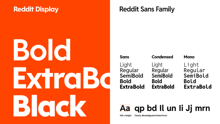
Reddit's new typography | Image credit: Reddit
Advertisement
Apart from its classic reddish-orange theme, Reddit introduces a palette featuring GuavaPink, LimeGreen, BananaYellow, and JuniperBlue. The introduction of new colours aims to enhance the vibrancy of the platform and its application.
The timing of this rebrand raises eyebrows, aligning with reports that Reddit might go public in the first quarter of 2024. Following a turbulent 2023 marked by conflicts with developers and subreddit protests, Reddit's strategic refresh signals a potential new chapter for the platform as it eyes the public market.