Updated 27 October 2025 at 17:32 IST
iOS 26.1 Will Let You Tone Down Liquid Glass Effects on iPhone
In iOS 26.1, a new setting lets you switch UI chrome from a clearer, highly transparent look to a more opaque, higher‑contrast style that’s easier to read and less visually busy.
- Tech News
- 2 min read

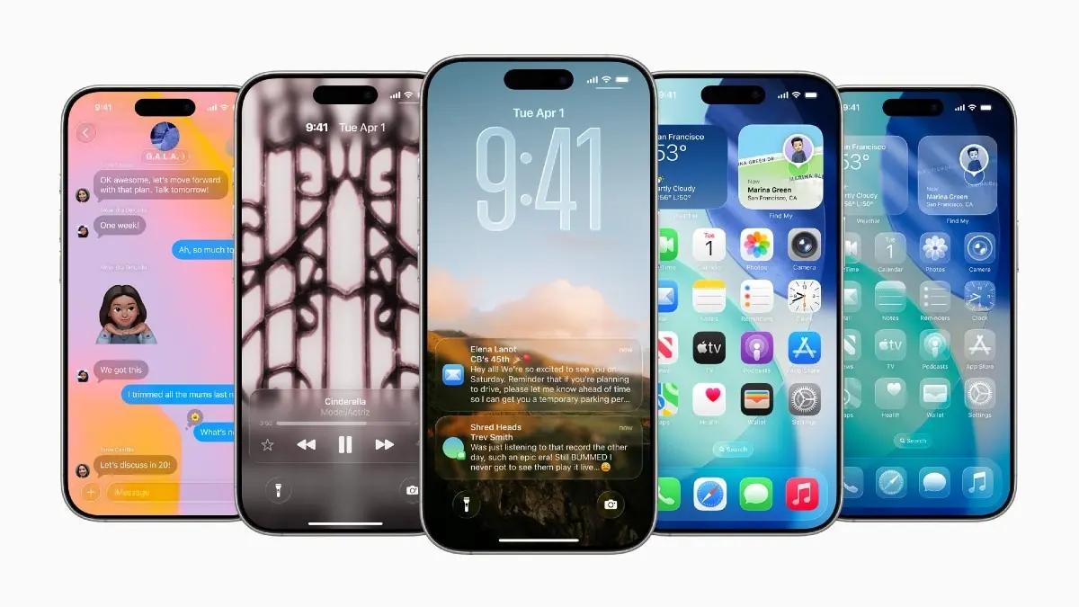
As the iOS 26.1 release nears, some iPhone users breathe a sigh of relief. Apple’s next iPhone update adds a long‑requested control for its new Liquid Glass design language: a simple way to make it less see‑through. In iOS 26.1, a new setting lets you switch UI chrome from a clearer, highly transparent look to a more opaque, higher‑contrast style that’s easier to read and less visually busy.
What’s changing
- New transparency toggle: In Settings > Display & Brightness > Liquid Glass, you can choose between Clear and Tinted. Clear maintains the current, glassy transparency; Tinted increases opacity and contrast for toolbars, tab bars, and menus.
- Where it applies: The change is most noticeable in app navigation bars, sheets, and Lock Screen alerts. It reduces “see‑through” bleed from wallpaper/content behind UI, improving legibility—especially in bright light or busy wallpapers.
- Not everywhere: Core areas like Control Centre, Home Screen icons, the App Library, and some widgets remain largely unchanged. This is a tone‑down, not a total switch‑off.

Why Apple added it
Liquid Glass modernised iOS with depth and translucency, but some users found it distracting or hard on readability. The Tinted option addresses accessibility and preference without abandoning the new aesthetic. It also pairs well with iOS’s existing Reduce Transparency and Increase Contrast options for those who want an even flatter, higher‑contrast experience.
How to adjust it
- Go to Settings > Display & Brightness > Liquid Glass.
- Pick Clear for the classic 26.0 look, or Tinted to add opacity and contrast to UI chrome.
- For maximum clarity, also try Settings > Accessibility > Display & Text Size > Reduce Transparency and Increase Contrast.
- Dark Mode often makes Liquid Glass subtler; combine Tinted with Dark Mode for the least visual noise.
When to prefer the Tinted option
- Busy wallpapers: If you like photos or patterns on your Home/Lock Screen, switch to Tinted to keep titles and buttons readable.
- Outdoor use: Tinted improves toolbar visibility in bright sunlight, where Clear can get washed out.
- Focused apps: Productivity and reading apps feel “quieter” with Tinted, reducing background distraction when scanning dense lists.
Published By : Shubham Verma
Published On: 27 October 2025 at 17:32 IST
